A New Era in Brand Identity and Website Innovation for tyntec.
tyntec | Telecommunication & Cloud Systems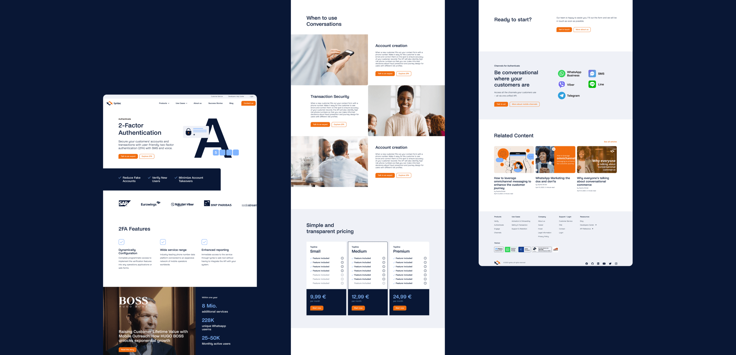
tyntec is a telecommunication and cloud software company with more than twenty years of experience in the mobile messaging sector. In 2023, think moto redefined their brand identity with to goal to reflect the companies status as industry leader. The challenge was to conveys the brands maturity and experience inside the brand, while staying true to its innovative, flexible, and supportive traits.
| Client | tyntec |
| Year | 2023 |
| Agency | for think moto |
MY FOCUS
OTHER SERVICES


Together with a team of stakeholders, from both the client side and think motos, we developed the three core points: Business, Brand, and User in a full-day workshop. Using methods like "The Golden Circle", Stakeholder Map, User Stories, Brand as Person, and Archetypes, we worked on both the current state of the market strategy and a future vision for the brand Tyntec.

Brand Strategy
The brand strategy forms the foundation for the conception and design of the website. It includes the Brand Purpose, Value Proposition, and Brand Personality, as well as the design principles that reflect the brand's personality in the facets of UX, Tone of Voice, Navigation, and UI.
Information Architecture
For the strategy of the new website, we developed a new information architecture, including a new sitemap, a conversion concept, and a navigation concept.
Moodboards
In the form of moodboards, we developed initial design directions. The moodboard forms the basis for the design of the website but can evolve over the course of the project.

Content Map
As the first step in the website conception, we created a list of content blocks per website template. This content map shows the journey a user goes through during their visit to the website.
Wireframe
The hierarchy of website content is determined by wireframes, which form the framework of the website.
Design Direction
The key templates were designed based on the moodboard. After consultation with Tyntec, the conception and design moved into the next phase – the Detailed Design Phase.

In the final step, the remaining templates for mobile and desktop were designed. In addition, a new icon set was developed and the visual language was modernized with fresh visuals and contemporary design. In developing the icons, we focused particularly on visualizing Tyntec's product architecture – Verify, Engage, Authenticate.


